We build tools to explore and explain complex data through clear and interactive visual displays that reveal hidden patterns
In scientific research we often rely on standard plots and graphs to summarize our findings but the world is rarely two dimensional. Real world phenomena unfold in three or more dimensions across space time and scale. Traditional figures sometimes fail to communicate these patterns effectively especially when variables interact in complex nonlinear ways.
Global CO2 ppm for January-March of 2020. This camera move orbits the Earth from a distance. Visualization by: Andrew J Christensen
Visualization is more than just a final figure. It is a process of translating insights from high dimensional models and datasets into something that others can understand and trust. Whether for publications presentations or teaching we need to be both accurate and creative in how we represent our data.
We are especially interested in interactive visualizations which allow users to explore patterns at their own pace. These tools are powerful for communicating difficult ideas in a more intuitive and hands on way. We believe they have strong potential not just in academic work but also in outreach education and citizen science.
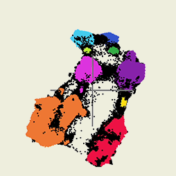
One example is our UMAP based visualization of precipitation phase data. This tool projects thousands of high dimensional profiles into a two dimensional space to reveal clusters pathways and transitions between rain snow and mixed phase events. The results are not only scientifically meaningful but also accessible to non experts.
We also study the design principles that make visualizations more effective. This includes the use of perceptually uniform color scales to avoid misleading interpretations as well as the importance of consistent labeling clear legends and thoughtful layout. A great visualization should not only inform but also invite curiosity and exploration.
Visualization plays a role in almost every project in our group. As we continue developing models for retrieval classification and prediction we are equally focused on finding better ways to make those models understandable and compelling. Whether for expert audiences or the general public this remains a central part of how we do science.
Related Publications
2025
JGR: ML&C
Leveraging Sparse Autoencoders to Reveal Interpretable Features in Geophysical Models
Fraser
King, Claire
Pettersen, Derek
Posselt, and
2 more authors
Journal of Geophysical Research: Machine Learning and Computation, 2025
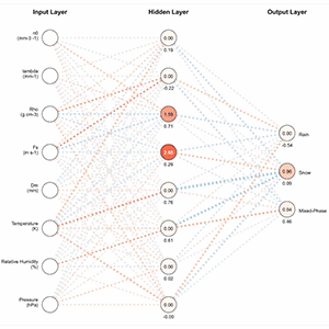
Machine learning is an increasingly popular tool in the geosciences, offering new approaches to numerical weather prediction and complex dataset analysis. However, as reliance on these techniques grows, pressing questions about model transparency, internal biases, and trust emerge. While post-hoc explainability analyses can provide insights on how neural network (NN) outputs are generated, a robust framework for interpreting internal decision-making remains underdeveloped. We address this challenge by exploring a framework to better understand the inner structure of NNs using sparse autoencoders (SAEs). With simplified multilayer perceptrons (MLPs), we demonstrate that hidden layer neurons often exhibit polysemantic behavior where each feature is mapped to a linear combination of neurons, creating an overcomplete representation. This phenomenon, known as superposition, arises when networks encode more features than available neurons, causing neurons to respond to multiple, seemingly unrelated inputs. By introducing a regularized SAE that learns from the original MLP’s activations, we can disentangle these representations, resulting in a 33% reduction in the average number of sensitive inputs per neuron. Applied to a precipitation classification model, this framework reveals evidence of monosemantic behavior in which neurons respond to a single meaningful concept tied to specific physical phenomena such as temperature and fallspeed thresholds for precipitation phase partitioning. We observe similar monosemantic behavior in SAE activations from a snowfall rate regressor related to particle concentration intensity, and vertical radar structures. This framework supports the development of more physically consistent interpretations of hidden neuron activations and improved trust in operational ML models across the geosciences.
2025
Sci. Adv.
Decoding global precipitation processes and particle evolution using unsupervised learning
Fraser
King, Claire
Pettersen, Brenda
Dolan, and
2 more authors
High-quality hydrometeor microphysical observations are essential for accurate precipitation estimates and for evaluating weather and climate models. However, analyzing these properties is challenging due to their high variability, complex interactions, and large data volumes. In this study, we examine more than 1.5 million minute-scale rain and snow particle attributes and collocated meteorological variables from seven global measurement sites over 9 years. Applying Uniform Manifold Approximation and Projection (UMAP) for nonlinear dimensionality reduction, we reduce the dataset’s dimensionality by 75%, identifying nine distinct precipitation groups and associated particle evolution pathways. UMAP effectively captures the global structure of precipitation phases such as rain, snow, and mixed-phase types, revealing clear patterns that linear methods struggle to resolve. The resulting UMAP manifold offers a unique perspective on precipitation phase and intensity, advancing our understanding of particle evolutionary processes and offering valuable insights for improving weather and climate models and remote sensing precipitation estimates. Analyzing rain and snow particles reveals hidden patterns, improving precipitation classification for better model predictions.
2022
AMT
DeepPrecip: a deep neural network for precipitation retrievals
Fraser
King, George
Duffy, Lisa
Milani, and
3 more authors
Remotely-sensed precipitation retrievals are critical for advancing our understanding of global energy and hydrologic cycles in remote regions. Radar reflectivity profiles of the lower atmosphere are commonly linked to precipitation through empirical power laws, but these relationships are tightly coupled to particle microphysical assumptions that do not generalize well to different regional climates. Here, we develop a robust, highly generalized precipitation retrieval algorithm from a deep convolutional neural network (DeepPrecip) to estimate 20 min average surface precipitation accumulation using near-surface radar data inputs. DeepPrecip displays a high retrieval skill and can accurately model total precipitation accumulation, with a mean square error (MSE) 160 % lower, on average, than current methods. DeepPrecip also outperforms a less complex machine learning retrieval algorithm, demonstrating the value of deep learning when applied to precipitation retrievals. Predictor importance analyses suggest that a combination of both near-surface (below 1 km) and higher-altitude (1.5–2 km) radar measurements are the primary features contributing to retrieval accuracy. Further, DeepPrecip closely captures total precipitation accumulation magnitudes and variability across nine distinct locations without requiring any explicit descriptions of particle microphysics or geospatial covariates. This research reveals the important role for deep learning in extracting relevant information about precipitation from atmospheric radar retrievals.